Services:
- Creative & Design
- Printing
- Digital Marketing
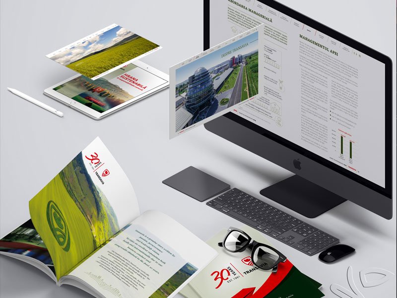
Can a brochure capture 30 years of excellence in just 28 pages?
Even after more than 12 years of collaboration with the client, how do you create fresh materials while staying true to the brand’s personality—fluid, subtle, and consistent in communication?
4 Key Principles We Followed in Creating This Anniversary Brochure
The format – an aesthetic, functional, or economic choice?
Probably one of the most common mistakes companies make when choosing the type of brochure to use is starting from the form and working toward the creative concept. This reasoning is often dictated by the budget they intend to stick to.
In reality, the creative concept, along with the volume and type of information to be printed, should dictate the paper size.
For the Transavia brochure, we chose the classic and elegant A4 format, continuing the tradition of previous materials.
Message optimization helps you stay relevant
Never forget who the audience is or the purpose of the brochure. Synthesize the information and stay relevant to the audience’s needs.
It’s about you, but it’s for them, so the layout must accurately reflect the associated message. The content should be as simplified, graphical, and suggestive as possible.
Numbers aren’t necessarily a passion killer
For a 30-year anniversary brochure, the temptation is to cram as much information as possible into a limited space.
But don’t fall into this trap! Choose relevant indicators, pair them with concise text, custom graphic symbols, and whitespace to enhance readability. A clean, breathable layout increases the likelihood that the brochure will actually be read.
So, how do you best symbolize growth?
Company progress is typically represented through key performance indicators, but is that enough to showcase the full scale of the business?
In this case, charts remain the most relevant, due to their visual impact. Combine them with clearly separated text segments or pictograms, which help break the monotony of almost accounting-like content. Add color consistency for a touch of personality.